| intro_site_3.zip |
In making my site, I took the most basic elements from the tutorial site we did and worked from those. It doesn’t really look similar to that site, but I honestly couldn’t find any information on the basics of an html page anywhere else online. For design, at first I looked around at examples of personal websites, but all of the ones I liked had Javascript elements and were terribly confusing (though very cool). I wanted mine to still look cool but remain simple and easy for me to work with. My method was pretty much just messing around with the code until things worked out more or less the way I wanted! I would drastically change one little element (such as increasing the padding by a huge amount) in order to see what it changed, and then I would go from there. Trial by success, I guess?
The vision I had for this site was for it to just look decent. That’s a simple goal, but let me explain it a little more. Basically I didn’t want it to look like something from the early 2000s or something a child would make (as if children could code…though actually, these days I wouldn’t be surprised if they could). Design-wise I wanted something minimalistic but still effective and attractive—aka not boring. I wanted it to look dynamic if that makes sense. I think I did an okay job achieving this vision. I was even able to find a cool decorative element to put on my home page, as I had been inspired to do by the design of my planner where I drew my ideas. In fact, I am particularly fond of the home page but not as fond of the rest. However I can certainly live with this, since it’s a massive step up from the last html site I created from scratch!
The vision I had for this site was for it to just look decent. That’s a simple goal, but let me explain it a little more. Basically I didn’t want it to look like something from the early 2000s or something a child would make (as if children could code…though actually, these days I wouldn’t be surprised if they could). Design-wise I wanted something minimalistic but still effective and attractive—aka not boring. I wanted it to look dynamic if that makes sense. I think I did an okay job achieving this vision. I was even able to find a cool decorative element to put on my home page, as I had been inspired to do by the design of my planner where I drew my ideas. In fact, I am particularly fond of the home page but not as fond of the rest. However I can certainly live with this, since it’s a massive step up from the last html site I created from scratch!
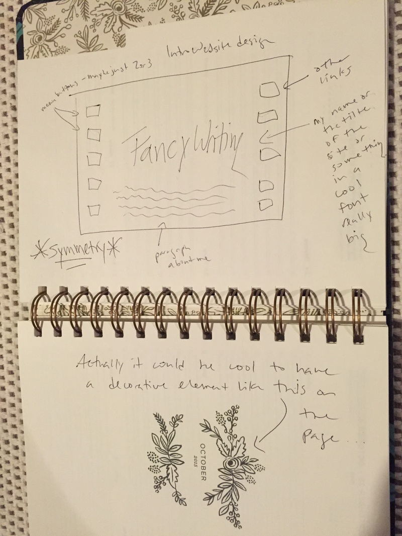
I think I primarily used the visual and spatial modes in creating this website. As you can see in the drawing I made of my design concept for the site, my emphasis was on the large text I wanted featured in the center, with the other boxes and paragraphs less emphasized. I changed the position of my menu/link boxes, but other than that I did alright sticking to my plan.
Also note where I wrote “symmetry” surrounded by asterisks. This was another important aspect of my site that I think I did manage to execute, especially on the home page with the pink heading text mirroring the pink (Fun fact: they are the exact same pink because I used a color-determiner-website-thing to find the color value. I am very proud of this.) decorative element under the menu, which itself is spaced equally between the two elements. Spatial symmetry is appealing to me on other websites, so I wanted to use it in my own.
I didn’t really rely on the linguistic mode as much since I never know what to write about myself on these kinds of things. However the sparse presence of text just served to increase my site’s minimalistic vibe, in a way. I can tell myself that, at least. I have a tiny bit of aural mode in the sense that you can click on my "Listening to" link on the "Currently" page and be taken to a Youtube playlist of the Hamilton soundtrack (theatre kid forever!), but I don't think this counts since it's not directly on my site.
I really enjoyed making this site. Using HTML gets easier every time I do it, which blows my mind because it's not something I ever thought I would be able to do. It's not going to win any of the design awards I discovered in my research, but I made it and it makes me happy.
Update: I originally posted the wrong zip file, but I have corrected it!
 RSS Feed
