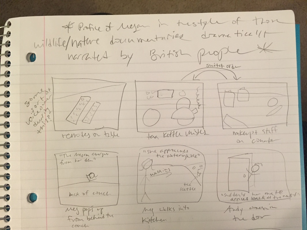
In making my site, I took the most basic elements from the tutorial site we did and worked from those. It doesn’t really look similar to that site, but I honestly couldn’t find any information on the basics of an html page anywhere else online. For design, at first I looked around at examples of personal websites, but all of the ones I liked had Javascript elements and were terribly confusing (though very cool). I wanted mine to still look cool but remain simple and easy for me to work with. My method was pretty much just messing around with the code until things worked out more or less the way I wanted! I would drastically change one little element (such as increasing the padding by a huge amount) in order to see what it changed, and then I would go from there. Trial by success, I guess? The vision I had for this site was for it to just look decent. That’s a simple goal, but let me explain it a little more. Basically I didn’t want it to look like something from the early 2000s or something a child would make (as if children could code…though actually, these days I wouldn’t be surprised if they could). Design-wise I wanted something minimalistic but still effective and attractive—aka not boring. I wanted it to look dynamic if that makes sense. I think I did an okay job achieving this vision. I was even able to find a cool decorative element to put on my home page, as I had been inspired to do by the design of my planner where I drew my ideas. In fact, I am particularly fond of the home page but not as fond of the rest. However I can certainly live with this, since it’s a massive step up from the last html site I created from scratch! 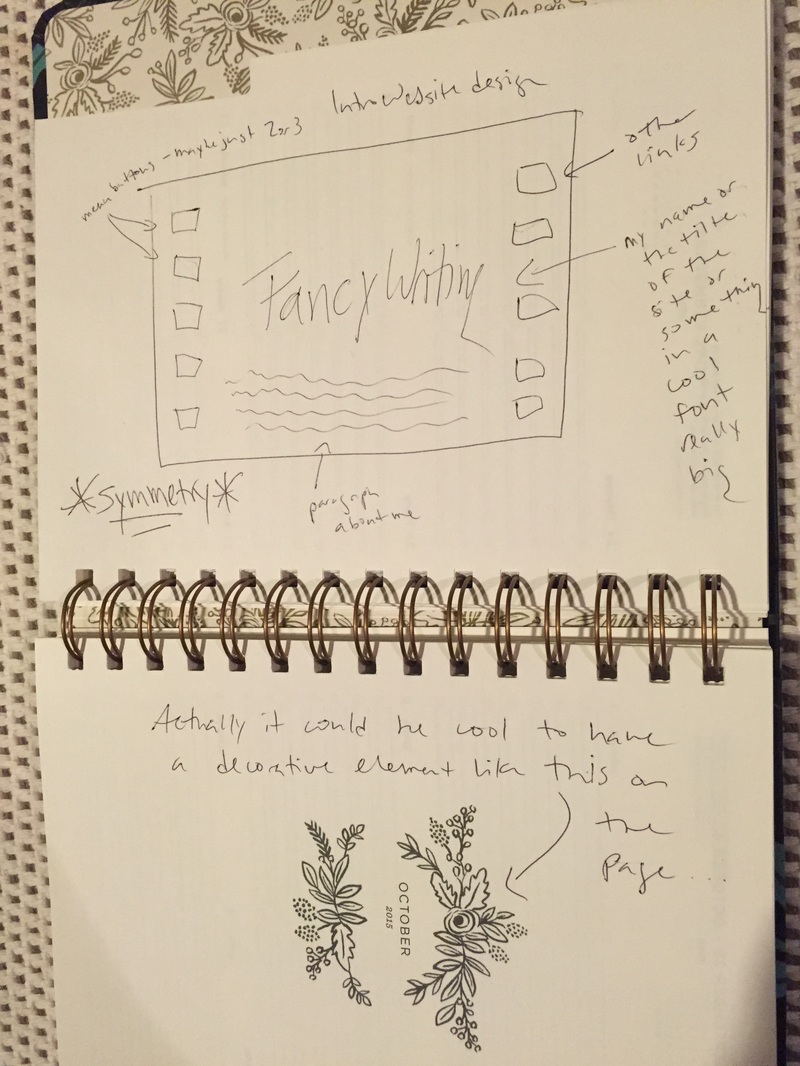 I think I primarily used the visual and spatial modes in creating this website. As you can see in the drawing I made of my design concept for the site, my emphasis was on the large text I wanted featured in the center, with the other boxes and paragraphs less emphasized. I changed the position of my menu/link boxes, but other than that I did alright sticking to my plan.
Also note where I wrote “symmetry” surrounded by asterisks. This was another important aspect of my site that I think I did manage to execute, especially on the home page with the pink heading text mirroring the pink (Fun fact: they are the exact same pink because I used a color-determiner-website-thing to find the color value. I am very proud of this.) decorative element under the menu, which itself is spaced equally between the two elements. Spatial symmetry is appealing to me on other websites, so I wanted to use it in my own. I didn’t really rely on the linguistic mode as much since I never know what to write about myself on these kinds of things. However the sparse presence of text just served to increase my site’s minimalistic vibe, in a way. I can tell myself that, at least. I have a tiny bit of aural mode in the sense that you can click on my "Listening to" link on the "Currently" page and be taken to a Youtube playlist of the Hamilton soundtrack (theatre kid forever!), but I don't think this counts since it's not directly on my site. I really enjoyed making this site. Using HTML gets easier every time I do it, which blows my mind because it's not something I ever thought I would be able to do. It's not going to win any of the design awards I discovered in my research, but I made it and it makes me happy. Update: I originally posted the wrong zip file, but I have corrected it! RhetoricThe audience of the informational campaign Just Label It is people who are already familiar with GMOs (notice it does not have a tab that says “What are GMOs?” but rather, “About GMO Foods”). It presupposes familiarity with the issue, because people who have never heard of GMOs would probably not know to visit this site. Another layer of the audience could also be people who are politically active and engaged citizens, since the first two photos you see on the site contain the words “Take Action” in large print that leads to a petition website when you click the photo. 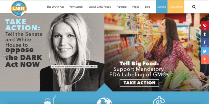 Source: justlabelit.org This leads me to conclude that the purpose of this website is not just to provide information, but to tell American people who care about the issue how they can help, as evidenced by the presence of the “Take Action” photos as well as the blue and yellow boxes found in the upper right corner of the page that say “Donate” and again, “Take Action.” This site fits in the genre of other informational campaigns since it includes features such as informational blog posts and a link for donations. However since this is an issue that can be affected through actions such as writing letters or signing petitions (you can’t exactly write a letter to Congress asking them to stop breast cancer), the site goes beyond what some other sites in its genre does. It includes clear and direct routes for taking action by providing links to petitions or instructions on how to email congressmen, etc. DesignEmphasis is certainly on the phrase “Take Action” which can be seen in three different spots when you first open the website. Color is also used to emphasize important details on the page such as the logo and the donate/take action boxes in the corner and, again, the words “Take Action” on the Gwyneth Paltrow photo. Emphasis is also placed on the blue bar (again, color is used to emphasize) containing common questions about GMOs. The eye is drawn to the brightly colored bar because those questions are probably the first thing someone will want to know—especially those who aren’t ready to “take action” right away and feel the need to scroll down the page a little more. As with the emphasis, color is used to create contrast on the webpage and draw the eye to the most important aspects of the page. These include, as I have mentioned before, the text “Take Action,” the colored boxes in the corner and the blue question bar. If you continue to scroll down the webpage after the blue bar, you come to a section of blog posts. These posts are not emphasized by any color or special boxes. They are a collection of photos and white boxes set against a light grey background—not much contrast there. They blend in and are de-emphasized because they are not as important as the rest of the home page. The blog posts provide the most specific information, but the purpose of the home page is not to give deep information, but to present ways for the consumer of the text to take action about GMOs. The blog posts are there if you want them, but they won’t distract you if you just want to know where to click to send a letter to the FDA. 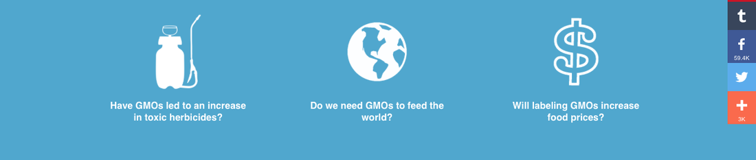 Source: justlabelit.org This site is set up so that the most important elements are at the very top and very bottom of the home page. At the top, there is the menu bar which provides easy access to the most vital information the reader needs about the issue as well as the two ways he or she can get involved (the much mentioned donate/take action box). This is pretty standard organization for a website. The bottom is a bit different. Usually the very bottom of a website contains information on how to contact the organization that the website is about. While this site does have a contact tab for itself at the bottom, more importantly, the information for contacting the FDA, Congress, and large food corporations are found just above the standard bottom-of-a-website tabs. This is great organization because it takes a standard trope of web design and turns it into another way for the website to reach and persuade its audience. 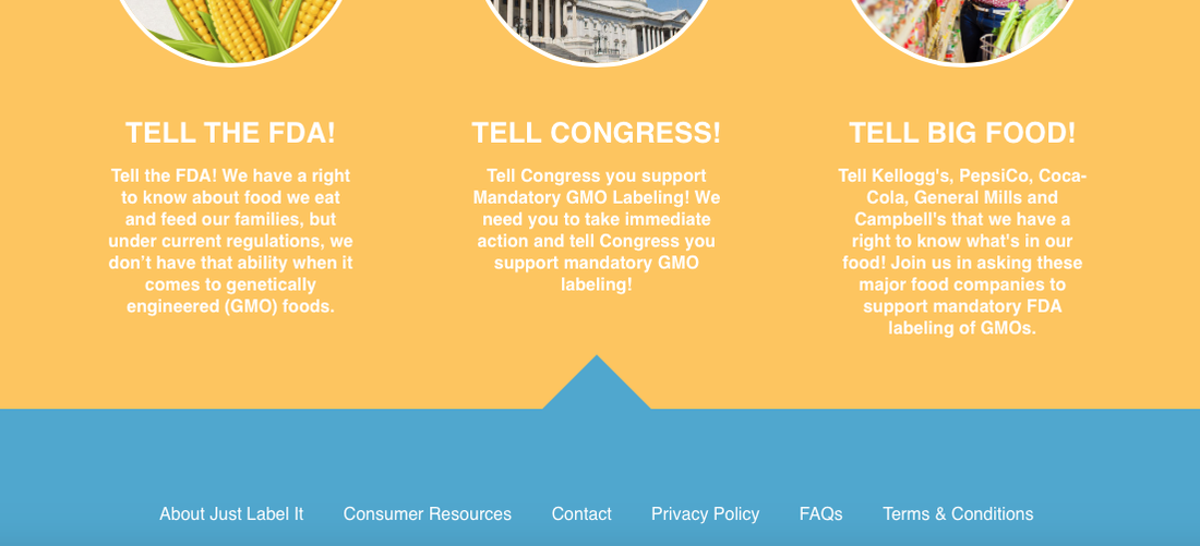 Source: justlabelit.org |
Anna SharpBelmont writing major who is about to become a Real Adult™ and still owns like 12 coloring books. Archives
May 2016
Categories |
||
 RSS Feed
